Table of Contents
7 things designer forget to design
That are an important part of a given project

7 things designer forget to design because we were occupied in perfecting some other designs. Moreover, even professional designers skip some details. We are all humans, after all.
There are many crucial aspects that you have to consider to make the most out of your project. However, forgetting some designs while you are busy in perfecting a few other features is pretty
common.
The “Thanks for Signing Up” Page
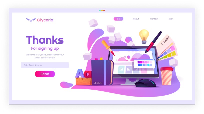
The most important thing that designer forget is “Thanks for signup page.” Mostly, this screen usually comes after a user creates an account and tells them to go confirm their email address.
The Welcome Email
The second most important thing the designer forget is “the welcome email” .Obviously we introduce your company in a creative and positive way and communicate the benefits of signing up, such as discounts, special offers, updates, and more.
Default User Avatar
Signing up with social accounts or services like
Gravatar have really helped us show off our smiling faces.
Favicon
The another main thing the designer forget to design is “favicon”. Actually, a favicon is a small icon or collection of icons associated with a website, web page, or web
application. Moreover, It’s displayed within the browser tabs and bookmarks bar.

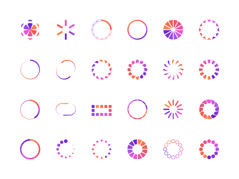
The loading state
Indeed the main goal of the Loading State pattern is to provide a visual clue that content is loading and the user has to wait before the view can be populated.
The App Store Images
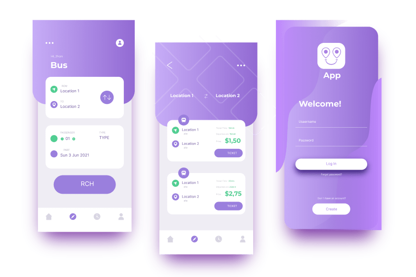
Especially, App store images are epic marketing assets. furthermore, they illustrate compelling stories, showcasing an app’s primary function and purpose. Essentially, app store images are crucial marketing messages designed to grab the user’s attention.
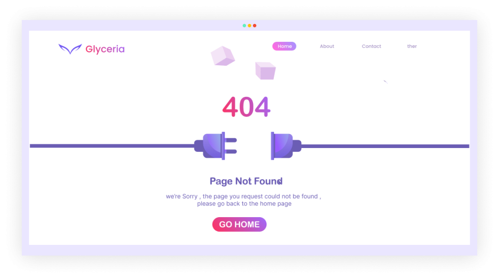
The 404 error Page
Indeed, App store images are epic marketing assets. Moreover, they illustrate compelling stories, showcasing an app’s primary function and purpose. Essentially, app store images are crucial marketing messages designed to grab the user’s attention.
